If recruiters only glance at a resume for a few seconds, how do you make yours stand out? An killer resume design can be the differentiator between getting noticed or going unnoticed. These ten tried-and-tested tricks increase readability, clear ATS filters, and capture recruiter eyeballs in an instant.
1. Keep It Simple and Clean
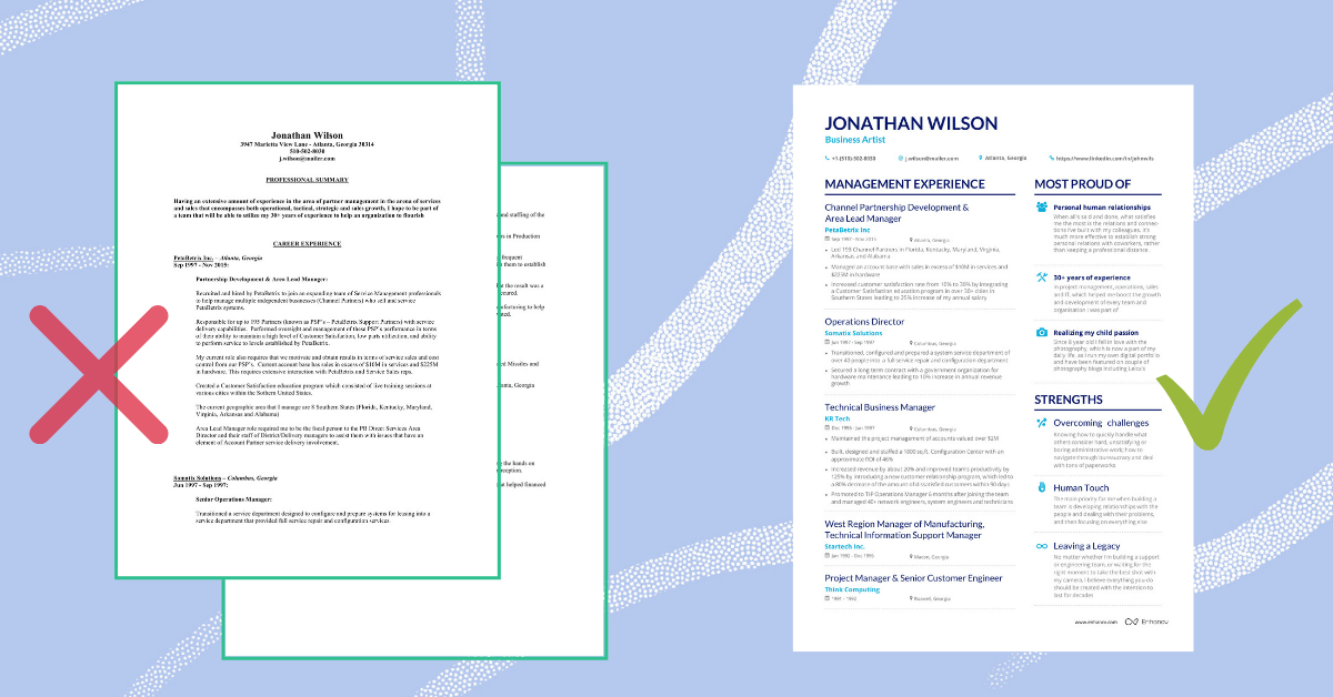
Simple design is crucial. Steer clear of complex templates with images or dual columns that tend to confuse applicant tracking systems (ATS) as well as recruiters. One-column designs in plain black and white enhance readibility and guarantee cross-device compatibility.
2. Make the Top Section Count
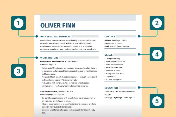
The top third of your resume is where a recruiter’s attention starts. Place your name, contact information, and a compelling two-sentence summary here with keywords pulled from the job posting. Employ numerals for accomplishments to pop visually.

3. Use Consistent Fonts and Sizes
Keep to clear fonts such as Arial, Calibri, or Helvetica in 10–12pt for body text and slightly bigger for titles. Standardized formatting increases professional look and readability.
4. Align Text for Easy Scanning
Left-justify all text, and right-justify dates and places to establish visual contrast. Do not use justification, which can introduce unbalanced spacing and slow reading.
5. Embrace White Space
Generous margins (around one inch) and clear spacing between sections help break up the layout and improve scanability. White space lets the eye rest and guides the reader smoothly down the page.
6. Use Bold Headers and Sub-headers
Distinct section headings — like “Work Experience,” “Education,” and “Skills” — should be bold or larger in size. This hierarchy directs attention to key areas quickly and makes skimming a breeze.
7. Choose Color Sparingly
Understated utilization of one or two subdued colors, like navy or dark green, can serve to make standout sections stand out without overwhelming the content. Steer clear of glitzy graphics that can divert or compromise ATS compatibility.
8. Quantify Achievements Early
Use bullet points near the top that start with action verbs and include metrics. For example: “Increased sales by 25% in six months.” Studies show resumes with numeric results are more likely to stand out.
9. Incorporate Relevant Keywords
Recruiters and ATS scan for industry-specific terms. Mirror the job description with exact keywords (including both spelled out and acronyms). Proper headings like “Skills” or “Certifications” help with ATS parsing.
10. Test ATS Compatibility
Avoid headers, footers, tables, or icons that ATS tools struggle with. Save your resume in an ATS-friendly format such as .docx or PDF (depending on employer preference). You can also check your resume with online ATS tools to ensure it gets through the filters.
Why These Tricks Work
Recruiters take less than ten seconds on the first glances. A well-organized, clean resume with obvious headings and measurable outcomes catches attention immediately. At the same time, ATS-compliant formats make sure your resume is not screened out before a human eye comes across it.
Final Thoughts
Seize each second. Use these ten layout secrets to produce a resume that grabs attention on first read, reads smoothly for hiring managers, and clears ATS software. A well-designed resume won’t get you the job, but it will get you noticed.
Ready to build an eye-catching, ATS-optimized resume in minutes? Try Salahkart’s free resume builder. Use our clean, customizable templates and layout tools to grab recruiter attention from the first five seconds. Start now at Salahkart.com.
Would you like a downloadable infographic or Canva template to accompany this blog?
Leave a Reply